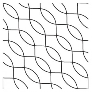
very simple pattern created in illustrator

 |
in through the out door | "Even a stopped clock gives the right time twice a day." - Unknown |
| Blog ♦ Music ♦ Artwork |
|
Logo draft217.09.2010 | 8:47 AM | PatrickTweaked a few things, its important to note that the “OPC” part is actually not a recognized font, Its just a circle within a circle, the “O” a rectangle with a rounded rectangle next to it, the “P”, and the former with a chunk out of it, all with some adjustments made with the pathfinder and compounding some paths. The main idea behind the logo is, well, to be frank were gonna be painting on top of nikes so I had to incorporate some sort of swoosh into the logo, I think this fits nicely. Although, I must admit it looks like a surf board manufacturer’s logo.
Logo draft17.09.2010 | 12:50 AM | PatrickA friend and I are looking to start some sort of a business operation, if that’s what you wanna call it. Painting and designing custom shoes. Well see how it turns out once we get the first order of shoes in; apparently it was pretty popular at Oak Park in Chicago. Here’s a logo draft -
Logo Replication13.09.2010 | 2:38 AM | PatrickHere’s a jpg of a few logos, one of the two is the original and the other is a replica created by me in Adobe Illustrator. Test your eye, which one is the original?
ANSWER: 1,3,5 are replicas; 2,4,6 are originals from google. Appearance12.09.2010 | 5:31 PM | PatrickWe beat Eureka College 7-0 today in soccer. As I was walking onto the field for the first half I heard one of their players say, “God, we must have the ugliest jerseys in the nation.” I thought it was interesting how this player was so focused on appearance rather than the game ahead. It made me think about being a visual human being and how each one of us can recognize good art and design. Growing up, I’ve always been taught that all art is subjective. I wanna suggest its actually more objective than we think. Its easy to tell the difference between good design and bad design. I general, I consider good art to be simply pleasing to look at. True, many works do portray lots of emotions and can tell a story, but at the end of the day if its not truly pleasing to view, whos gunna look at it? The Striped Striker10.09.2010 | 9:48 AM | PatrickFirst self portrait I’ve been working on in Illustrator. Imported high-quality image from http://barryboyer.smugmug.com/Boys-High-School-Soccer, used Live Trace black and white, added artifacts and continuous lines.
New Project10.09.2010 | 12:20 AM | PatrickI gotta new project that I wanna work on during my free time, apart from other things. I want to recreate the most famous logos using only the pen tool in Adobe Illustrator without tracing, just eyeballin’. This will most likely include but is not limited to: the nike “swoosh”, the dove “dove”, pepsi, tacobell, burgerking, an assortment of hood ornaments, etc. This is a productive practice because it will increase my skill with the pen tool, a vital skill in Illustrator. Hopefully I’ll be able to get the latest and greatest Illustrator CS5 for my dorm computer so I don’t have to make the trek to Dows, (not that I don’t like working in Dows).
Test08.09.2010 | 12:23 AM | PatrickMaking sure the tumblrize plug-in is working right. More info here – http://wordpress.org/extend/plugins/tumblrize/ Digital Art I Sketchbook30.08.2010 | 10:09 AM | PatrickFirst entry for digital art I. I’ll post something of significance later, I have an idea. |
LinksMetaTags8-bit Academics Coe College design digital art disasterpeace illustrator Macroeconomics Music talk box WP Cumulus Flash tag cloud by Roy Tanck and Luke Morton requires Flash Player 9 or better. |