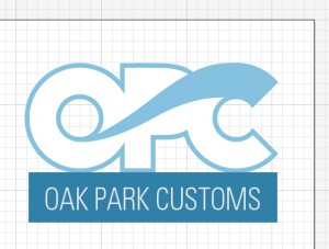
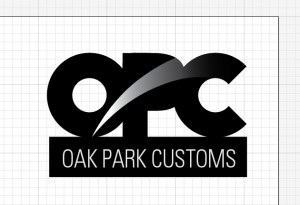
Tweaked a few things, its important to note that the “OPC” part is actually not a recognized font, Its just a circle within a circle, the “O” a rectangle with a rounded rectangle next to it, the “P”, and the former with a chunk out of it, all with some adjustments made with the pathfinder and compounding some paths. The main idea behind the logo is, well, to be frank were gonna be painting on top of nikes so I had to incorporate some sort of swoosh into the logo, I think this fits nicely. Although, I must admit it looks like a surf board manufacturer’s logo.
